Photography Color Theory Explained: Mastering Color Harmony and Composition
Color is one of the most powerful tools in a photographer’s arsenal. It can evoke emotions, guide the viewer’s eye, and create a memorable impact that defines your style and brand. Yet, many photographers shy away from deliberately using color or rely on instinct alone, missing out on the full potential of color to elevate their images and business. Understanding photography color theory is essential for every photographer — whether you are a beginner trying to grasp the basics or a working professional looking to refine your visual storytelling.
Photography color theory is more than just knowing which colors look “nice” together. It’s a structured way to understand how colors interact, how to create balance through color harmony photography, and how to compose images that communicate your intended message effectively. This knowledge helps you make intentional choices during shooting, editing, and client presentations.
In this comprehensive guide, we’ll break down essential concepts of photography color theory, explore practical applications, and provide step-by-step advice to help you master color in your work. By the end, you’ll understand how to use color deliberately to create stronger images and build a more compelling photography business.
—
Key Takeaways
– Photography color theory is the study of how colors interact and influence perception in images.
– Understanding color harmony photography helps you create visually pleasing and emotionally resonant photos.
– Effective color composition guides the viewer’s eye and enhances storytelling.
– Learning to use color intentionally improves your editing workflow and branding.
– Practical application of color theory can differentiate your work in a competitive photography market.
– Common mistakes like over-saturating or ignoring color balance can undermine your images.
– A step-by-step approach to color selection, shooting, and editing will yield consistent, professional results.
—
What is Photography Color Theory and Why Does It Matter?
At its core, photography color theory is the study of how colors relate to each other and how these relationships impact the viewer’s perception. Colors affect mood, feelings, and the overall aesthetic of your photograph. Whether you’re shooting portraits, landscapes, product photography, or events, understanding color theory enables you to create images that resonate and stand out.
The Basics of Color Theory
Color theory is rooted in the color wheel, a circular diagram showing primary, secondary, and tertiary colors. The primary colors (red, blue, yellow) combine to form secondary colors (green, orange, purple), which in turn mix to create tertiary colors. This wheel is a fundamental tool for photographers to understand color harmony photography — how to pair colors effectively.
Why Photographers Need Color Theory
– Emotional Impact: Different colors evoke different emotions. Warm colors like red and orange can create excitement or warmth, while cool colors like blue and green convey calm or melancholy.
– Visual Interest: Thoughtful use of complementary or analogous colors makes images more engaging.
– Branding: Consistent color themes help photographers establish a recognizable style.
– Client Communication: Knowing how color affects mood facilitates better client consultations and image selection.
– Post-Processing: Color theory guides editing choices, from color grading to retouching.
For example, wedding photographers might use soft pastels to convey romance, while commercial photographers often rely on bold, contrasting colors to highlight products.
—
How to Use Color Harmony Photography to Enhance Your Images
Color harmony refers to the pleasing arrangement of colors in an image that is visually balanced and aesthetically satisfying. In photography, applying color harmony principles allows you to create images that feel natural and compelling.
The Four Main Color Harmony Schemes
1. Complementary Colors
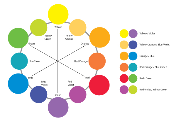
Colors opposite each other on the color wheel (e.g., blue and orange). This high-contrast combination draws attention and creates vibrant images.
Example: A portrait with a subject wearing a blue outfit against an orange sunset background.
2. Analogous Colors
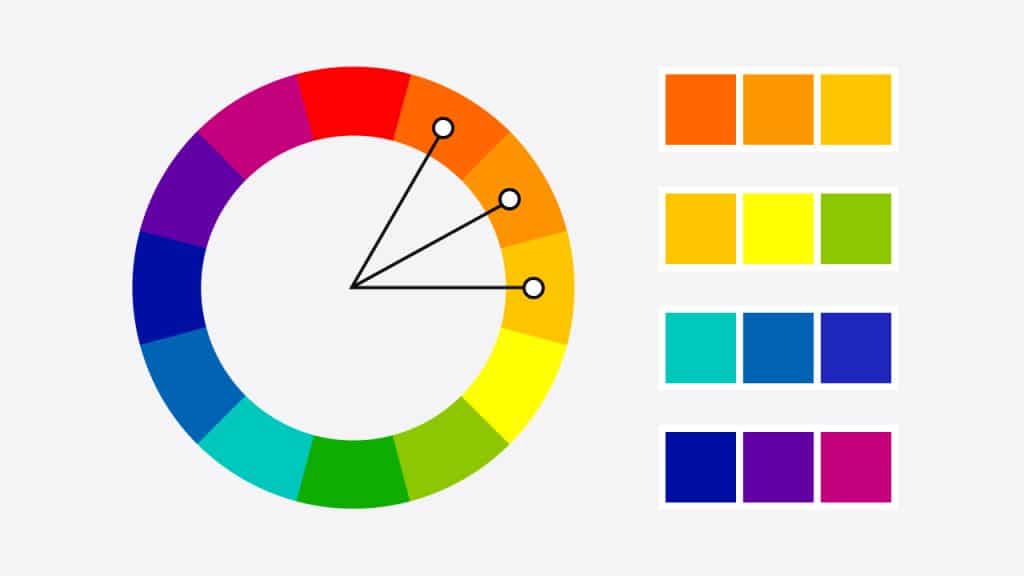
Colors next to each other on the wheel (e.g., green, yellow-green, and yellow). These create harmonious, soothing images with subtle contrast.
Example: A nature shot with various shades of green and yellow leaves.
3. Triadic Colors
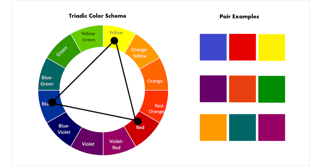
Three colors evenly spaced (e.g., red, yellow, blue). This approach offers a balanced combination with vibrant color variety.
Example: A street scene with red signs, yellow taxis, and blue sky.
4. Split-Complementary Colors
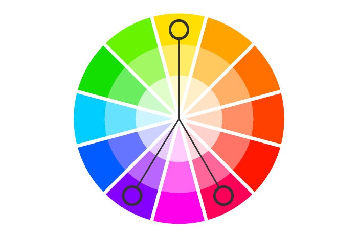
One base color plus the two colors adjacent to its complementary color. This offers contrast but less tension than complementary pairs.
Example: A fashion shoot with a purple dress and yellow-green and yellow-orange accessories.
Applying Color Harmony in Photography
– During Shooting: Scout locations or style your subject’s wardrobe based on harmonious color schemes.
– In Composition: Use background elements or props that complement your subject’s colors.
– Editing: Adjust hues and saturation to emphasize harmony or create contrast.
Practical Example
Imagine shooting a lifestyle portrait in an urban environment. You could dress your subject in a teal outfit and position them against a rust-orange wall (complementary colors). This deliberate choice makes the subject pop and creates a dynamic image without heavy editing.
—
The Role of Color Composition in Photography
While color harmony focuses on which colors to use, color composition involves how you arrange colors within the frame to guide the viewer’s attention and tell a story.
Key Principles of Color Composition
1. Dominant Color: Choose one color to dominate the scene, establishing mood and tone.
2. Accent Colors: Use one or two additional colors to create points of interest.
3. Balance: Distribute colors evenly to avoid visual clutter or imbalance.
4. Contrast: Use color contrast to highlight subjects or create depth.
5. Simplicity: Limit the color palette to avoid overwhelming the viewer.
Techniques for Effective Color Composition
– Leading the Eye: Use bright or contrasting colors to direct the viewer’s gaze toward the subject.
– Framing: Natural frames with colors (like green foliage) can isolate and highlight subjects.
– Layering Colors: Use foreground, midground, and background colors to create depth.
– Using Negative Space: Areas with muted or neutral tones balance vibrant colors.
Example Scenario
In food photography, the dominant color might be the rich red of a tomato sauce, with accents of green basil and white mozzarella. The composition could place the red sauce centrally, with the green and white creating visual triangles that move the eye around the plate.
—
Practical Steps to Master Photography Color Theory
Understanding theory is one thing — applying it consistently is another. Here’s a step-by-step framework to implement color theory in your photography practice.
Step 1: Study the Color Wheel
Spend time familiarizing yourself with the color wheel and the relationships between colors. Use digital tools or printed charts to visualize schemes.
Step 2: Plan Your Shoot with Color in Mind
– Scout locations or backgrounds with color harmony.
– Select wardrobe and props that follow a color scheme.
– Communicate your color vision with clients or models.
Step 3: Use Color to Support Your Narrative
Decide the mood or message you want your photo to convey, then choose colors that reinforce it. For instance, use blues and purples for calm portraits or reds and yellows for energetic scenes.
Step 4: Compose with Color Balance
Arrange elements with color contrast and balance. Use color-blocking techniques or natural environments to support your composition.
Step 5: Edit with Color Theory
– Adjust color temperature to warm or cool your image.
– Use selective color adjustments to enhance harmony.
– Avoid over-saturation that breaks natural harmony.
– Apply color grading to unify the palette.
Step 6: Review and Refine
Analyze your images on different devices to ensure colors render well and maintain harmony. Seek feedback from peers or clients.
—
How Color Theory Impacts Your Photography Business
Color is not just an artistic consideration — it’s a business asset. Understanding and using photography color theory effectively can differentiate your services and attract your ideal clients.
Brand Consistency
Clients often choose photographers whose style reflects their own brand or aesthetic. A consistent color palette in your portfolio, website, and marketing materials signals professionalism and reliability.
Client Communication and Expectations
Explain your use of color during consultations to help clients visualize the final product. For example, if you specialize in warm tones for family portraits, share sample images to align expectations.
Pricing and Packages
Offer color grading or specific color-themed sessions as premium add-ons. For example, a “vibrant color” package for commercial clients or “soft pastel” for newborn photographers.
Marketing and Social Media
Consistent color themes in your posts create a cohesive feed that attracts followers and potential clients. Use color theory to plan your content calendar and image selection.
Real-World Example
A wedding photographer specializing in soft, muted tones might attract couples seeking romantic, timeless images. By mastering color harmony and composition, their portfolio stands out in a crowded market focused on bright and bold styles.
—
Editing Workflow Tips for Color Mastery
Post-processing is where you can refine your color choices and reinforce harmony.
Start with Color Calibration
Ensure your monitor is color calibrated to avoid inaccurate hues.
Use Curves and Color Balance Tools
Adjust overall tonality and color casts systematically.
Selective Color Adjustments
Enhance or mute specific colors to improve harmony.
Use LUTs and Presets Wisely
Choose presets that match your color vision and tweak them to avoid uniform results.
Monitor Skin Tones
In portraits, preserve natural skin tones while adjusting background or clothing colors.
Batch Editing
Create templates that apply your color style efficiently across multiple images.
—
Common Mistakes Photographers Make with Color
Even experienced photographers can stumble when managing color. Awareness of common mistakes helps you avoid them.
Over-Saturation
Pushing colors too far can make images look unnatural and distracting. Instead, aim for balanced saturation that supports your mood.
Ignoring Color Harmony
Random or clashing colors confuse viewers and weaken the image’s impact. Planning your palette is essential.
Neglecting White Balance
Incorrect white balance skews colors and can be difficult to fix in post.
Overcomplicating Color Palettes
Too many competing colors clutter the frame. Simplify your palette to maintain focus.
Relying Solely on Editing
Color decisions should start at shooting, not only in post-processing. Capture the right colors in camera for best results.
Forgetting Cultural or Emotional Context
Colors have different meanings in various cultures and contexts. Be mindful of your audience.
—
What to Do Now: Your Action Plan to Improve Color Use in Photography
Ready to take your color skills to the next level? Follow this practical action plan:
1. Learn the Color Wheel: Download a color theory chart and study relationships daily for a week.
2. Analyze Your Portfolio: Identify your current color use and note areas of strength and improvement.
3. Plan a Color-Focused Shoot: Choose a project where you intentionally apply a color harmony scheme.
4. Experiment with Wardrobe and Props: Assemble a few outfits or objects that follow complementary or analogous colors.
5. Practice Color Composition: Shoot scenes paying attention to color balance, dominant and accent colors.
6. Edit with Purpose: Use color theory to guide your editing decisions. Avoid default presets; customize your style.
7. Seek Feedback: Share your images with peers or mentors focusing on color impact.
8. Apply Branding Consistency: Review your website and social media for a cohesive color theme.
9. Document Your Process: Keep notes on what works and what doesn’t for future reference.
Commit to practicing color theory in your next 5–10 shoots to build confidence and see tangible improvements.
—
FAQs
Q1: What is the easiest way for beginner photographers to start using color theory?
The simplest way is to start with the color wheel and experiment with basic harmony schemes like complementary or analogous colors. For example, shoot a portrait where the subject wears a color opposite the background color on the wheel. This creates natural contrast and balance without complicated setups. Gradually, you can explore triadic or split-complementary schemes as you become comfortable.
—
Q2: How does color theory affect post-processing and editing?
Color theory guides editing by helping you understand which colors to enhance, mute, or balance in your images. For instance, if your photo uses complementary colors, you may want to boost their saturation slightly to maintain vibrance. Conversely, if colors clash, selective desaturation can restore harmony. Color grading techniques also rely on theory to unify the palette and create a signature look.
—
Q3: Can color theory improve client satisfaction?
Absolutely. When you use color intentionally, your images better convey the emotions and style your clients want. Discussing color choices during consultations and showing examples helps manage expectations. Consistent color themes in your portfolio also attract clients who resonate with your style, leading to better matches and happier customers.
—
Q4: How do I balance color with other compositional elements?
Color should complement, not overpower, other elements like lighting, texture, and shape. Use the rule of thirds, leading lines, and depth alongside color to guide the viewer’s eye. For example, a bright color can highlight a subject placed according to the rule of thirds, making the image dynamic yet balanced.
—
Q5: What tools can help photographers with color harmony and composition?
Digital tools like Adobe Color Wheel, Coolors.co, or Pantone Studio aid in selecting harmonious palettes. Lightroom and Photoshop offer color grading and selective color adjustments. Mobile apps with color analysis assist on-the-go. However, training your eye and practicing remain the most important steps.
—
Conclusion
Mastering photography color theory is a game-changer for photographers at all levels. By understanding how colors interact through principles of color harmony photography and color composition, you gain the ability to create images that are visually compelling and emotionally engaging. This knowledge empowers you not only to shoot better photos but also to build a consistent style that attracts and retains clients, ultimately elevating your photography business.
Color is not a random choice but a deliberate tool for storytelling. Incorporate these concepts during planning, shooting, and editing to produce work that stands out in the saturated photography market. Remember, practice is key — the more you experiment with color theory, the more instinctive your choices will become.
Start today by analyzing your current work through the lens of color theory, plan a color-focused shoot, and refine your editing workflow. Over time, you’ll develop a confident, professional approach to color that enhances both your artistic vision and business success.
Embrace color as a vital element of your photography craft — it’s one of the most rewarding skills you can master.