
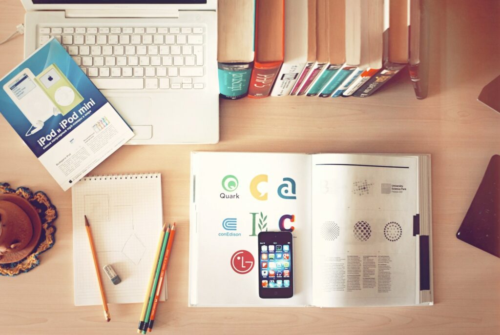
How to Create a Photography Logo in 2025
In the visually driven world of photography, first impressions are everything. Before anyone sees your portfolio or Instagram feed, the first glimpse they get of your brand is often your photography logo. It’s more than just a symbol — it’s your visual identity, your creative fingerprint, and often the make-or-break factor in whether a potential client takes you seriously.
In 2025, creating a photography logo has evolved significantly. With the rise of AI-driven design tools, dynamic branding trends, and a growing appreciation for authenticity and minimalism, photographers now have more power — and more responsibility — to craft logos that not only look good but tell a compelling story.
Whether you’re a seasoned wedding photographer looking to rebrand, a newborn photographer building your business from scratch, or a content creator pivoting into commercial work, understanding how to create a meaningful, timeless photography logo is essential.
In this in-depth guide, you will learn:
- What makes a great photography logo in 2025
- The latest tools, trends, and typography choices
- Design psychology and how to use it to your advantage
- Step-by-step walkthroughs of creating your logo
- Case studies of successful photographers and their logos
- Advanced branding techniques
By the end, you’ll not only understand the process but also have practical strategies to design a photography logo that’s memorable, marketable, and future-ready.
Section 1: Understanding Photography Logo Design Fundamentals in 2025
Understanding the fundamentals of logo design is essential for any photographer looking to build a solid brand. This section explores the psychological and strategic elements that form the backbone of a great photography logo. From crafting an emotional connection with your audience to ensuring your logo reflects your niche, these fundamentals will guide your creative decisions. By mastering these principles, you’ll be better equipped to design a logo that resonates with clients and stands the test of time.
1.1 The Psychology Behind a Photography Logo
Understanding the psychology behind logos helps you intentionally shape how your audience perceives your brand. Visuals trigger immediate emotional responses, and a thoughtfully crafted photography logo can convey trust, elegance, or bold creativity in seconds. This subsection explains how elements like symmetry, white space, and font shape influence viewer perception. Whether you’re aiming to appear luxurious, minimalistic, or playful, psychology should guide your design choices.
Your logo is your brand’s handshake. In a crowded field, it needs to communicate professionalism, creativity, and trust at a glance. Studies by the University of Loyola (Maryland) show that color increases brand recognition by up to 80%, and consistent branding across all platforms can increase revenue by 23% (Forbes, 2023).
Elements of a great logo:
- Simplicity – A cluttered logo confuses viewers. Clean designs stand out.
- Memorability – Your logo should be easy to remember after a single glance.
- Relevance – It must speak directly to your niche (e.g., baby photography vs. fashion).
- Versatility – It should work in black & white, be scalable, and fit social media formats.
- Timelessness – Avoid trends that will look outdated in two years.
1.2 Visual Identity and Brand Positioning
A logo is more than decoration — it’s a strategic tool to position your brand in the minds of your audience. Your visual identity should align with your photography niche and values. In this subsection, we examine how choosing specific styles, icons, and fonts can support your brand’s story and business goals. You’ll learn how small design tweaks can impact how professional, premium, or niche-specific your logo feels to your target clients.
When choosing a logo style, align it with your niche:
- Fine Art Photographers often use elegant serif fonts and minimalist icons.
- Adventure or Wildlife Photographers lean on rugged or naturalistic themes.
- Wedding Photographers typically choose romantic, script-based typography.
Quick Tip: Create a mood board on Pinterest or Milanote with your brand colors, competitors’ logos, and inspiration. This will guide your creative decisions.
Section 2: Choosing the Right Tools and Platforms
Before diving into design, it’s critical to select the right tools. Whether you’re a DIY enthusiast or someone seeking professional help, your choice of tools and platforms can impact the quality, scalability, and adaptability of your photography logo. In 2025, there’s an abundance of AI-powered and user-friendly design platforms that cater to both beginners and advanced users. This section will help you assess which platform aligns with your skill level, budget, and branding goals.
2.1 Best Logo Design Tools in 2025
Choosing the right tool can make or break your logo design process. With the advancement of AI, today’s tools do more than suggest fonts — they build complete visual systems. This subsection compares top platforms in 2025 and helps you determine the best match based on your goals, from simple templates to fully custom vector creations. Knowing when to use each tool can save you time and deliver polished, professional results.
AI has revolutionized logo design. In 2025, these are the top platforms:
- Looka – AI-powered logo generator with branding kits.
- Canva Pro – Easy drag-and-drop tools, now with AI design assistant.
- Adobe Express – Integrated with Adobe Fonts and stock assets.
- Tailor Brands – Personalized branding packages based on user input.
- Figma + Plugins – Advanced control for designers familiar with UX/UI tools.
Stat Insight: As of 2024, over 68% of freelancers use AI tools for branding (Upwork Annual Report).
2.2 DIY vs. Hiring a Designer
Your decision to design yourself or hire a pro depends on budget, skill level, and how you value visual branding. This subsection dives into the pros and cons of each route and when it makes sense to invest in expert help. You’ll also learn about hybrid strategies — like starting with an AI tool and having a designer refine it — to get the best of both worlds.
- DIY Advantages: Affordable, fast, total control
- DIY Disadvantages: Risk of amateur design, lack of brand cohesion
- Hiring a Designer Advantages: Professional quality, tailored to your story
- Hiring Disadvantages: Expensive ($250–$2000), longer turnaround
Pro Tip: If hiring, ask for your logo in multiple formats: .PNG, .SVG, .EPS, and .JPG.
Section 3: Typography and Color Psychology for Photography Logo
Typography and color are two of the most powerful design elements. They don’t just make your logo look good—they influence how it’s perceived. Fonts communicate personality, while colors trigger emotions. Understanding how to pair the right typefaces and hues is crucial in building a logo that conveys the right message. This section provides detailed guidance to help you choose type and color combinations that elevate your brand and appeal to your target audience.
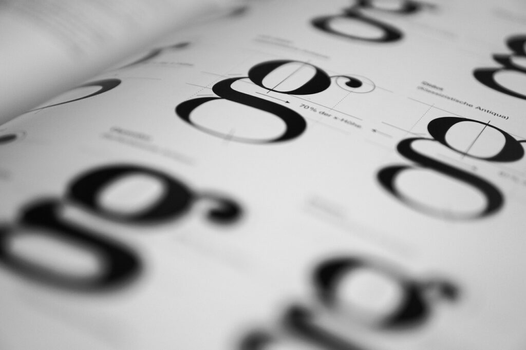
3.1 Choosing the Right Font Style
Fonts do more than convey words — they express character. This subsection discusses how to select fonts that reflect your photography style and client expectations. Whether you’re capturing weddings, products, or editorial portraits, your typography should reinforce your brand voice. We’ll also cover practical advice for pairing fonts and avoiding readability issues that could diminish your logo’s impact.
Typography sets the emotional tone:
- Serif Fonts (e.g., Playfair Display): Classic, trustworthy, traditional
- Sans Serif Fonts (e.g., Montserrat, Lato): Modern, clean, neutral
- Script Fonts (e.g., Great Vibes): Elegant, personal, romantic
- Display Fonts (e.g., Bebas Neue): Bold, impactful, trendy
Font Pairing Example:
- Name: Montserrat Bold
- Tagline: Lato Light Italic
Avoid: Overused fonts like Papyrus or Comic Sans, or using more than two fonts.
3.2 Picking a Color Palette That Sells
Colors evoke emotion and build recognition — critical elements in a photographer’s visual identity. This subsection explores the psychology behind color choices and shows how to apply them effectively in your photography logo. You’ll also learn how to create a balanced palette using free tools and test combinations that enhance your brand message without overwhelming your visuals.
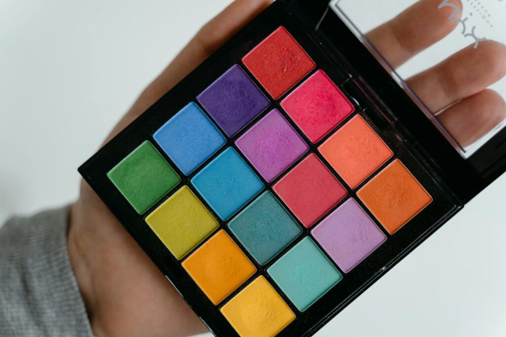
Color psychology for photographers:
- Black & White: Class, elegance (popular for portrait and fine art photographers)
- Earth Tones: Trust, nature (great for outdoor and adventure brands)
- Blush & Gold: Softness, love (ideal for weddings or baby shoots)
Use tools like Coolors.co or Adobe Color Wheel to generate harmonious palettes.
Section 4: Crafting a Logo That Works Across Mediums
Your photography logo needs to be as versatile as your work. Whether it’s being used on Instagram, business cards, or as a watermark on high-res images, the logo must remain clear, recognizable, and attractive. This section breaks down how to design logos that adapt to different mediums while maintaining brand consistency. You’ll learn about responsive design, optimal file formats, and practical tips for scalable usage.
4.1 Responsive and Scalable Logo Design
Your logo must adapt to various formats — from large desktop headers to tiny favicons. This subsection unpacks how to design for scalability and responsiveness, ensuring your logo looks sharp and clear regardless of device or size. Learn how to create multiple logo variants and why vector formats like SVG are essential for digital use.
Your photography logo needs to shine everywhere:
- Social media profile icons
- Website headers
- Watermarks on images
- Print media (business cards, brochures)
- Merch (T-shirts, camera bags)
Design Tips:
- Create a primary logo, secondary logo, and favicon/symbol.
- Test your logo in both color and grayscale.
- Check visibility at small sizes (e.g., 32x32px for favicons).
4.2 Watermarking Your Work Without Compromising Aesthetics
Watermarking protects your work — but if done poorly, it can ruin your aesthetic. This subsection focuses on how to apply watermarks elegantly using your logo. You’ll explore placement strategies, opacity settings, and variations that balance protection with professional presentation, ensuring your branding enhances rather than distracts from your photography.
Don’t let your watermark ruin your image.
Best Practices:
- Keep opacity between 20–40%
- Place it consistently in the corner (or center if sharing on social)
- Use the logo symbol alone, or your initials if needed
Example: Peter McKinnon uses a monogram (PM) rather than full logo when watermarking videos.
Section 5: Branding Strategy and Integration
A logo is only as strong as the brand it represents. For photographers, branding goes beyond visuals—it encompasses voice, messaging, and the overall experience. This section dives into how to integrate your logo into a broader branding strategy. You’ll discover how to position your brand in the market, create a professional brand kit, and ensure every touchpoint—from your website to your watermarked photos—reinforces your identity.
5.1 Advanced Brand Positioning for Photographers
Advanced brand positioning involves mapping your logo and branding to your audience’s mindset. This subsection explores frameworks for understanding your ideal clients and tailoring your visuals to attract them. Whether you’re serving corporate clients or emotional milestones, positioning your brand with intention can lead to higher trust and better referrals.
Your logo is a part of your brand — not the whole. Tie it to a complete strategy:
- Define your brand mission (e.g., “To capture authentic motherhood moments.”)
- Use consistent tone and style across platforms
- Ensure logo, colors, and voice align with your target audience
Example: A maternity photographer might use pastel tones and soft script, while an edgy fashion photographer could use bold geometric shapes and dark hues.
5.2 How to Create a Brand Kit in 2025
A well-organized brand kit saves time, enforces consistency, and simplifies delegation. This subsection outlines how to build a robust brand kit in 2025 using free and paid tools. You’ll learn what assets to include, how to format them, and how to use your brand kit to train team members or maintain coherence across all platforms.
Use tools like Canva Brand Kit or Notion to document:
- Logo variations (full, icon, stacked)
- Font hierarchy
- Color hex codes
- Social media templates
Quick Win: Having a brand kit ensures faster workflows when working with editors, clients, or social media managers.
Section 6: Real-World Applications of Photography Logo
This section explores how your photography logo will appear in everyday branding activities. Beyond the design phase, the true test of a logo is how it performs in real-world use. Whether you’re watermarking your images, designing packaging, or uploading social profile photos, your logo should enhance your brand identity without overpowering your work. You’ll learn how to strategically apply your logo across various customer touchpoints to build brand recognition, consistency, and professionalism.
Photography logos come to life in daily use:
- Watermarking for portfolio protection
- Profile Icons that match your visual voice
- Business Cards with QR codes linking to portfolios
- Packaging for printed albums or USBs
- Website headers and intro animations
Framework:
- Use logo as watermark → adds brand consistency
- Print on packaging → enhances professionalism
- Add to email signature → increases trust
Tip: Make sure the logo doesn’t overshadow your actual work — it should complement.
Section 7: Case Studies of Successful Photography Logos
Nothing brings learning to life better than real-world examples. In this section, we examine three diverse and successful photographers who have mastered the art of logo design. These case studies reveal how thoughtful typography, design consistency, and niche alignment contribute to brand success. Each example is broken down to show why it works, what can be learned, and how you can apply those lessons to your own photography logo journey.
Case Study 1: India Earl (Wedding Photographer)
- Uses elegant serif font + floral icon
- Reinforces brand as intimate and timeless
- Her logo scales beautifully across web and print
Case Study 2: Mango Street (YouTube + Photo Team)
- Bold, simple typeface
- Minimal and modern, appeals to Gen Z and creatives
- Integrated seamlessly into thumbnails, merch, and presets
Case Study 3: Brandon Woelfel (Portrait Photographer)
- Uses initials as watermark
- Subtle placement doesn’t distract from vibrant images
- Highly recognizable due to consistency
Takeaway: Successful logos are clean, brand-aligned, and adaptable.
Section 8: Future Trends and Advanced Tips
Design doesn’t stand still — and neither should your logo. This forward-looking section explores cutting-edge trends that are reshaping photography branding in 2025 and beyond. You’ll discover how AI and AR are changing the landscape, how to future-proof your visual identity, and how advanced design tactics can give your brand a competitive edge. Whether you’re refining an existing logo or creating something new, these insights will help keep your branding modern and relevant.
Emerging Trends in 2025
- Dynamic Logos: Slight animations for websites/social
- AI Co-Creation: Real-time logo generation based on brand sentiment
- Augmented Reality Logos: For use in immersive galleries or digital portfolios
Pro Tips for Staying Ahead
- Subscribe to design newsletters like Brand New and DesignTaxi
- Run A/B tests on your logo placement
- Collect feedback via Instagram stories or polls
- Revisit and refresh logo every 3–5 years
Future-Proofing Strategy: Ensure your logo is adaptable to new platforms like AR glasses or AI interfaces.
Conclusion
You’ve now walked through every step of building a standout photography logo — from understanding design psychology to applying your logo across real-world platforms and keeping it future-proof. This concluding section ties everything together, reminding you that your logo is more than a pretty graphic. It’s a cornerstone of your professional identity. Use what you’ve learned to make design decisions confidently and purposefully. And remember: A great logo grows with your brand, so don’t be afraid to refine and adapt it as your business evolves.
Your photography logo is more than just an emblem — it’s a story, an impression, and a tool that can either elevate or dilute your brand. In 2025, photographers have unprecedented access to tools and insights to create logos that resonate.
Key Takeaways:
- A great logo is simple, memorable, versatile, and timeless
- Tools like Canva, Looka, and Adobe Express can help you get started fast
- Typography and color must align with your niche and audience
- Use your logo consistently across all brand touchpoints
- Learn from successful examples and keep up with future trends
Call to Action: Ready to design your own? Try creating 3 logo mockups using the tools we discussed and ask 5 people from your ideal audience for feedback.
Your logo should work as hard as you do — make it count.
FAQs
1. What is the best software to create a photography logo in 2025?
In 2025, the best tools include Canva Pro, Adobe Express, and Looka. Canva Pro offers drag-and-drop simplicity with AI suggestions. Adobe Express provides premium typography and assets. Looka is ideal for AI-generated designs that include full brand kits. For advanced users, Figma and Illustrator remain top choices. Your best bet is to try 2–3 platforms and pick the one that feels most intuitive.
2. Should I use my name in my photography logo?
Yes — especially if you are a solo photographer or building a personal brand. Using your name adds a human touch and improves memorability. For instance, “Joseph Khalkho Photography” conveys professionalism and trust. You can pair your name with a visual icon or initials for a cleaner watermark version.
3. How many logo versions should a photographer have?
Ideally, at least three: (1) a full logo, (2) a compact version or icon, and (3) a favicon. The full logo is for your website or business card. The compact version works well as a watermark. The favicon is useful for your site’s browser tab or app. Having multiple versions ensures brand flexibility across platforms.
4. What are the most common mistakes in photography logos?
Some common errors include:
- Using too many fonts
- Choosing low-contrast color combos
- Making it too detailed (bad for scalability)
- Following trends too closely without originality
- Ignoring legibility at small sizes
Focus on clarity, consistency, and timeless appeal.
5. Can I trademark my photography logo?
Absolutely. You should consider trademarking your logo if it is unique and represents your brand. This protects it from being copied. In India or the U.S., you can apply through your country’s intellectual property office. Make sure you have original design files and don’t use stock icons in your final logo.
6. How do I choose the right font for my photography logo?
Start with your niche: romantic shoots need scripts; commercial work benefits from sans-serif fonts. Test fonts in various formats (web, print, watermark) and sizes. Tools like FontPair or Google Fonts are great for combinations. Avoid clichés or hard-to-read typography.
7. Is it okay to change my logo after a few years?
Yes — in fact, it’s recommended to refresh your logo every 3–5 years to stay current. Just ensure changes are evolutionary, not revolutionary, unless you’re rebranding. You can modernize the typeface or color without altering the entire identity. Brands like Apple and Coca-Cola do this well.
8. What file formats should I request for my logo?
Ask for high-res formats: PNG (transparent background), JPG (standard), SVG (scalable for web), and EPS (for print). This ensures you’re covered for all use cases, from social media to signage. Don’t accept only one format — versatility is key.
editor's pick
latest video
news via inbox
Nulla turp dis cursus. Integer liberos euismod pretium faucibua